Anna Wheaton - Independent Stampin' Up! ®
Demonstrator, Burleigh Waters, Q, AUSTRALIA
Phone 07 55 765 469 Email: wheatonanna@hotmail.com Blog: http://www.nudgeink.blogspot.com/


February 28, 2012

JAI Challenge 106 (but only my third!)


Over at Just Add Ink they have a sketch challenge this week.  Here is the sketch...


And here is my card.  I kept it pretty simple and did not add a sentiment.  I am happy with the white embossing behind the flower.


I hope you like my interpretation.  Pop on over to Just Add Ink to see what others have done. 

I'll have to leave off the recipe as I've got a big card order to fill and have to get on with it.

Thanks for stopping by!

Anna

February 27, 2012

Hostess Thankyou


If you want to see some fantastic examples of crisp, clean and colourful stamping projects, check out Inking Idaho, one of my favourite blogs to visit.  Becky Roberts has an eye for detail that you wouldn't believe.  She made some beautiful Scallop Envelopes as lollypop holders, and I loved the design she used.

Here is the Scallop Envelope a-la Becky, with a thankyou card inside and a wrapped Peanut Slab as a present.  The DSP and the Brads are just some of the items you can have FREE during Sale-a-Bration.


Thanks for stopping by!  Please leave a comment!  It's easy - just click on the word "comments" in blue at the bottom of this post.  I box will pop up where you can type a message.  It can be done anonymously if you wish.  I would love some feedback!

Anna

February 25, 2012

SAB Elementary Elegance

This is one of the cards we made in our one layer card class using the Elementary Elegance Sale-a-Bration set.  I love Crumb Cake as a base and the subtle colours of the flower go rather nicely.


The key is punched out using the Jewellery Tag punch.  This was inspired by a card I saw on Monica Gale's blog.

And here is a variation inspired by Teneale Williams.


Thanks for stopping by!

Anna

February 24, 2012

Same Same but Different

The great thing about homemade cards is that you can really personalise them.


In our last class we made some 'age cards' which we made any age we wanted.  We made this masculine one which was based on a fab design by Teneale Williams.


Stamps: Occasional greetings
Card: Crumb Cake, Well Worn DSP, Whisper White
Ink:  Soft Suede
Tools: Bigz Simple Numbers, Paper Piercer, Sanding Blocks
Accessories:  Antique Brads, Twill tape

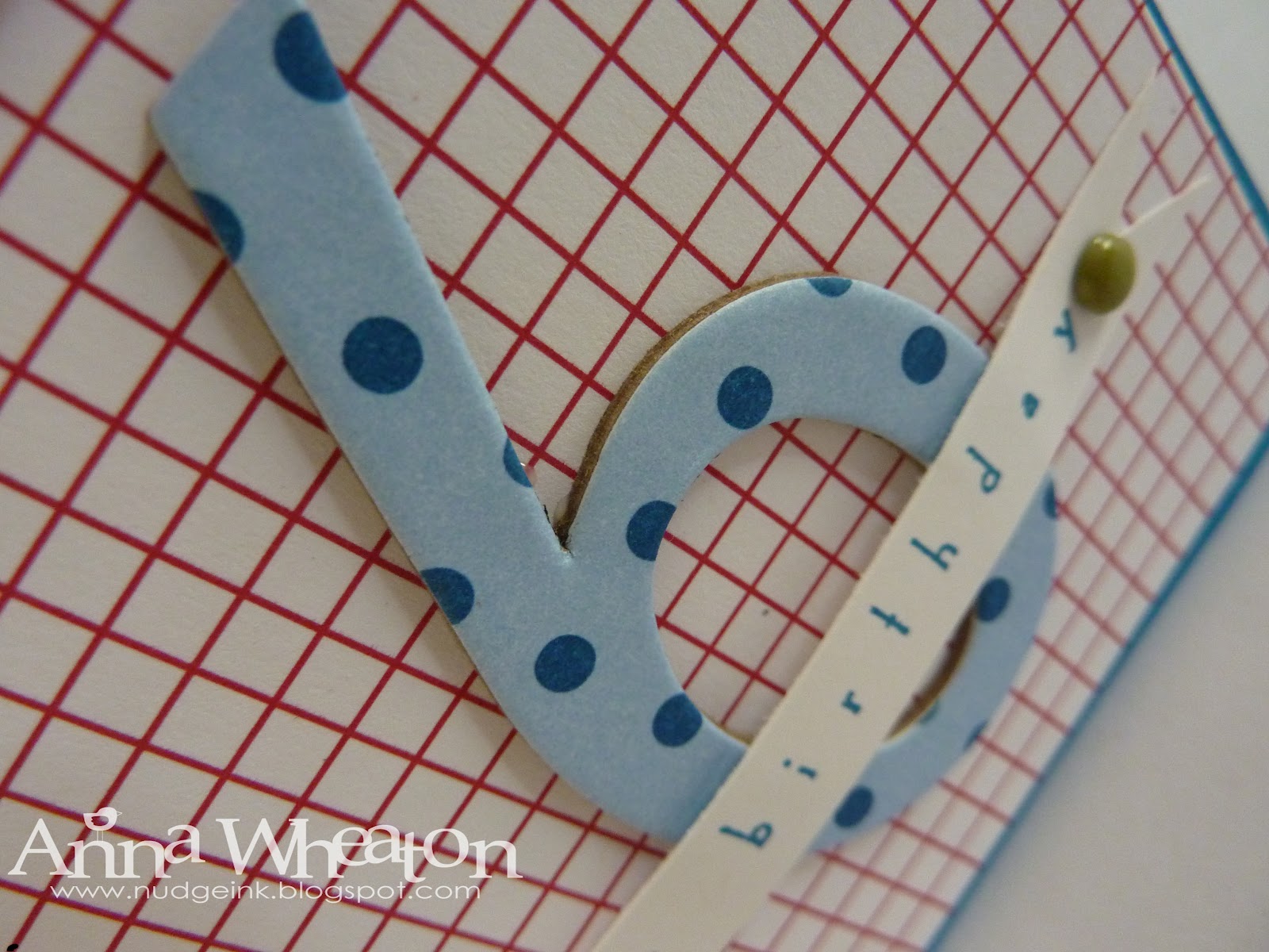
Then a friend asked me to make an age card for a boy so I made this one: the same design, but with quite a different look.


Then when I checked my notes, I discovered that the card was for a four year old, not a six year old.  Oops!  Anyone need a 6 y.o. card?

Stamps:  Occasional Greetings
Card: Pacific Point, Celebrations DSP (retired), Whisper White
Ink:  Pacific Point
Tools:  Bigz Simple Numbers, Paper Piercer
Accessories:  Brights Brads, Real Red Grosgrain Ribbon

Thanks for stopping by!

Anna

February 22, 2012

Catalogue Case

The Idea and Catalogue book is a great source of inspiration if you are stuck for ideas for cards.  This design is based on a card on page 78.  I kept the colour combination the same:  Pumpkin Pie, Rich Razzleberry, Old Olive (straight from the Colour Coach) but simplified the rest of the design.  I am not completely happy with it...I think it is missing a little something.  What do you think?


Stamps:  Medallion, Happiest Birthday Wishes
Card:  Pumpkin Pie, Rich Razzleberry
Ink:  Pumpkin Pie
Tools:  Scallop Trim Border
Accessories:  Old Olive 6.4 mm Grosgrain Ribbon

Thanks for stopping by!

Anna

February 20, 2012

SAB Fundraising thanks

In previous posts I mentioned that we had raised $90 at our last event which we donated to the Gold Coast Children's Hospital.  Denise was very excited to hear about our event and we received this in the mail, along with our receipt.


Thanks again to everyone who attended and bought raffle tickets for this cause!

Thanks for stopping by!

Anna

February 18, 2012

Masculine or Feminine

I started out making this card as a masculine card. 


The Soft Suede and Marina Mist were my colours of choice and the Perfectly Penned stamp set is perfect for mail cards.  But once I put the ribbon on...and then tied a bow!...well it became a feminine card.  What do you think?


SU! sell co-ordinating brads in each of the colour families to add that finishing touch to a card.  Here I have added a Marina Mist brad to the corner of the sentiment.

Stamps:  Perfectly Penned
Card:  Soft Suede, Whisper White, Beau Chateau DSP
Ink:  Soft Suede
Tools:  Paper Piercer,
Accessories:  Soft Suede Brads, Marina Mist 3.2 mm Taffeta Ribbon

Thanks for stopping by!

Anna

February 16, 2012

Valentine Kiss and Hug

This was a quick Valentine I made for hubby inspired by this design.  The splash of red is from Extreme Elements and the kiss and hug have been run through the Big Shot.


I always mail hubby's Valentine, even is I am home and emptying the mail box.  This Valentine's Day I was also working at the same place so I mailed a card to work and a card to home.  He thinks it's a bit funny but I have always done it.
Thanks for stopping by.

Anna

February 9, 2012

Treat yourself...

I still have a couple of projects from my launch to show you, plus I have been a bit flat out lately so haven't had time to prep any new projects for blogging.  Hopefully I'll get to some on the weekend!


I saw the idea for this on Pinterest (now that's a fun way to lose a few hours!) and thought I'd try it.  Remember those acrylic frames that are made of clear plastic that sandwiches the photo inside?  Well, you can still buy them at Coles, Big W, K Mart.  Instead of a photo inside, I put some DSP and co-ordinating card stock.  On the outside?  Some ribbon, a sentiment and a post-it note pad.  Just the thing for on someone's desk.


What a cute and useful gift.  Just noticed the reflection of my camera in the shiney plastic!  I love this sentiment and thought it was a good reminder to look after yourself!

Don't forget to look after yourself and treat yourself throughout Sale-a-Bration.  It's a great time to cross off some things on your wish list and get free products.

Thanks for stopping by!

Anna

February 6, 2012

No.#3?

Quite a few of the new stamp sets coming through feature numerals.  There's been a bit of a discussion on the SU! forum as to why and SU!s official response is that it is 'a current trend.'  And we thought it was some deep and meaningful reason!  Whatever the reason, they are very cute.


Here's a simple card I made for my launch, featuring the '3' stamp from Fresh Vintage.  I used four threes...  so does that make it a card for a mathematical 12 year old?


A simple design using Cherry Cobbler and Always Artichoke.

Here's an even simpler one.


Love that shine on the Seam Binding Ribbon.


Ooh..now that I look at that photo, I think my ribbon tying mojo had gone missing!

Thanks for stopping by!

Anna

February 4, 2012

Postage Stamp Punch Workout

One of my faves from the Summer Mini is the Postage Stamp Punch.  It co-ordinates perfectly with Pretty Postage but also with one of the SAB sets - Fresh Vintage. 


I saw this design on Chat Wszelaki's blog and loved the way the square stamp was placed over the floral image.


I also thought the contrast of the Melon Mambo and Early Espresso was striking.

Thanks for stopping by!

Anna